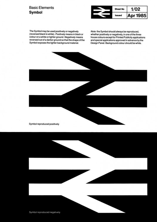


 “The British Rail Corporate Identity Manual comprised of four volumes, using the MULT-O 23-ring binder system. The four binders were issued in three installments: Binder 1 (not numbered), issued in July 1965, contained information on Basic Elements (symbol, logotype, lettering and colour). Binder 2, issued in November 1966, contained guidance on Printed Publicity plus some additional sheets for insertion into Binder 1, and future insertion into Binders 3 and 4, which were issued together in April 1970, together with additional sheets for the first two binders. Binders 3 and 4 contained information on architecture and signposting, rolling stock, lineside equipment, road vehicles, ships, liner trains, uniforms, stationery, miscellaneous and appendices (including an index) although two sections were ultimately to remain empty.” – Nick Job
Maybe you’ve always known that the Double Arrow logo represents two trains heading in opposite directions. Or maybe you didn’t. Either way, these extracts from the British Rail Corporate Identity Manual from 1965-1994 includes a wealth of digitised examples of British Rail design material collected over several years and suggest the mind boggling degree of work required to refine such understated (and then publicly funded) corporate design.
Expect Pt.II from the corporate identity handbook to rival all others, on these digital pages soon.
::
Copyright © Nick Job 2011–. All rights reserved.]]>
↧
British Rail Corporate Identity :: Double Arrow Pt.I
↧